
Graphic Design The New Basics: A Working Designer's Guide
Graphic design the new basics explained for practitioners: point, line, plane, scale, rhythm and modularity, and how each principle changes real client work.
Graphic Design The New Basics: A Working Designer's Guide
Most designers learn software before they learn form, then spend years wondering why their layouts feel unresolved despite technical fluency. Graphic design the new basics refers to the contemporary formal vocabulary of design — point, line, plane, rhythm, balance, scale, hierarchy, modularity, transparency, and pattern — reframed for screens, systems, and generative production rather than for the static printed page alone. It is the grammar underneath every good layout, and it is learnable in a way that taste is not.
Quick Answer: The new basics treat design as a system of relationships rather than a collection of objects. Master point, line, plane, scale, rhythm, balance, hierarchy and modularity, and most layout problems become diagnosable. Each principle is a lever you can name, adjust, and defend in a client review.
Why the Basics Were Rewritten for a Screen-First Era
The classic modernist vocabulary — grid, balance, contrast — was developed for fixed formats. A poster is a known size. A book page does not reflow. Contemporary design work rarely has that luxury: the same identity must survive a phone screen, a billboard, an email client that strips styling, and a component library maintained by engineers. That shift is what makes the "new" in the new basics meaningful.
The practical consequence is that principles are now expressed as rules that generate outcomes rather than as finished arrangements. You do not design a page; you design the relationships that will produce many pages. A type scale is a rule. A spacing system is a rule. A modular grid is a rule. The output is emergent, and the designer's skill is in specifying constraints tight enough to guarantee quality but loose enough to accommodate content nobody has written yet.
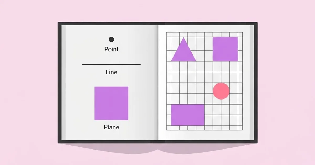
Some definitions to work from. Point is a position — the smallest unit of attention, whether a bullet, a node, or an isolated mark. Line is direction and connection — a rule, a column edge, an implied alignment between two objects. Plane is an area — a colour field, a card, a photograph's footprint. Scale is relative size and the perception of importance it creates. Rhythm is the repetition and variation of intervals. Balance is distribution of visual weight. Hierarchy is the deliberate ordering of attention. Modularity is construction from repeatable units.
These terms are not academic decoration. They are a diagnostic vocabulary. When a client says a layout "feels off," the useful response is not to nudge elements until it feels better — it is to identify which principle is failing. Usually it is scale contrast, alignment, or rhythm. The same structural thinking underpins working with a restricted formal vocabulary, which is why composing entire layouts from basic geometric forms is such an effective training exercise for developing this diagnostic eye.
The Core Principles and What Each One Controls
Each principle governs a specific failure mode. Learn them as tools, not as trivia.
- Point, line, plane. Every element in a layout is one of these three. Reducing a complex composition to points, lines, and planes strips away content and exposes structure. Do this to any layout that feels cluttered and the redundant elements become obvious immediately.
- Scale contrast. The ratio between your largest and smallest elements. Weak layouts almost always have insufficient scale contrast — everything is medium-sized. Pushing the primary element significantly larger and the secondary significantly smaller fixes more perceived-quality problems than any other single adjustment.
- Hierarchy. The order in which the eye should travel. Three levels is usually enough; five is unmanageable. Hierarchy is created by size, weight, colour, position, and isolation — and using all five at once on the same element is redundant.
- Rhythm and interval. Consistent spacing between repeated elements, with deliberate breaks. A spacing scale based on multiples of a base unit creates rhythm automatically and eliminates the arbitrary gaps that make amateur work feel unsettled.
- Balance. Symmetrical balance reads as formal, stable, institutional. Asymmetrical balance reads as dynamic and contemporary, and is harder because weight must be distributed by eye rather than by mirroring.
- Modularity. Building from repeatable units. A modular system scales to hundreds of pages and can be handed to other people without collapsing. It is the difference between a design and a design system.
- Transparency and layering. Overlapping planes create depth and relationship. Used carelessly it creates mud; used deliberately it links elements that belong together.
- Pattern and texture. Repetition at a small scale, adding surface interest and material character without adding content. Powerful as a secondary layer, destructive as a primary one.
These eight cover the overwhelming majority of practical layout decisions. Everything else — colour theory, typographic detail, motion — sits on top of this foundation rather than replacing it.
Diagnosing Layout Failures by Principle
This table converts vague client feedback into a specific principle and a specific fix. It is the single most useful thing to internalise from the whole framework.
| Feedback You Receive | Failing Principle | Concrete Fix | Check After Fixing |
|---|---|---|---|
| "It feels flat and boring" | Scale contrast | Increase the ratio between largest and smallest elements | Squint test shows one dominant element |
| "It looks cluttered" | Rhythm and grouping | Apply a consistent spacing scale and group related items | Whitespace intervals are consistent multiples |
| "It feels unprofessional" | Alignment and line | Align every element to a shared grid edge | No element sits on an arbitrary position |
| "I do not know where to look" | Hierarchy | Reduce to three levels and demote everything else | Thumbnail view still shows a clear entry point |
| "It does not feel like one brand" | Modularity | Define reusable components and a shared type scale | Two new pages can be built without new decisions |
The value here is conversational as much as technical. Being able to say "the issue is scale contrast, not colour" in a review positions you as a practitioner diagnosing a system rather than a service provider adjusting preferences.
How the Principles Behave Differently on Screen
Practitioner analysis, not published data — but consistent enough across projects to be treated as reliable working knowledge.
Scale contrast compresses on small screens. A poster can run a headline forty times the size of the caption. A phone screen cannot, because the largest comfortable size is bounded by viewport width. The practical adaptation is to create contrast through weight, colour, and isolation rather than size alone. Designers who only know print-scale contrast produce mobile layouts that feel monotonous.
Rhythm becomes more important, not less. On a fixed page, the eye takes in the whole composition at once and forgives minor spacing inconsistency. On a scrolling screen, the viewer experiences intervals sequentially, and inconsistent vertical rhythm is felt as a kind of stutter even by non-designers. A strict spacing scale matters more on screen than in print.
Alignment must survive reflow. A carefully balanced asymmetric composition can collapse when a headline wraps to three lines on a narrow viewport. The new-basics adaptation is to define alignment relationships rather than positions — "always aligns to the left column edge" rather than "sits 340 pixels from the left."
Modularity is now a deliverable. Clients increasingly need components, not compositions, because their teams produce most of their own material. A design that cannot be decomposed into reusable units has a short life. This is also why surface-level decisions like applying grain and pattern as controlled overlay layers should be defined as reusable treatments rather than hand-applied per artwork — every hand-applied decision is a future inconsistency.
Balance is judged in motion. Hover states, transitions, and scroll behaviour all affect perceived balance. A layout that is balanced when static can feel lopsided when one element animates. Review key screens with interaction running, not only as flat exports.
Common Mistakes and How to Avoid Them
Treating the grid as decoration. A grid that everything ignores is worse than no grid, because it creates near-alignments that read as errors. Either commit elements to grid positions or work deliberately off-grid with clear intent.
Too many hierarchy levels. Five type sizes, four weights, and three colours produce no hierarchy at all. Constrain to three levels of emphasis and force content to fit; if it genuinely cannot, the content structure is the problem.
Using every emphasis tool on one element. Big, bold, coloured, boxed, and centred simultaneously is not five times as emphatic. It is noisy. One or two emphasis signals per level is sufficient.
Arbitrary spacing. Values like 13px, 27px, and 41px chosen by eye create low-level disorder. Adopt a base unit and use multiples. This one change visibly improves most portfolios.
Confusing minimalism with reduction. Removing elements without strengthening the remaining relationships produces emptiness, not clarity. Reduction must be paired with increased scale contrast and tighter grouping.
Designing at the wrong zoom level. Composing at 150 percent produces layouts that fail at real size. Review at final size and at thumbnail, routinely.
Ignoring content behaviour. Designing with perfect placeholder text hides how the layout handles a two-word headline, a nine-word headline, and a missing image. Test all three before signing off.
Applying the New Basics: Rebuilding a Weak Layout
A practical walkthrough using a common artefact: a one-page service overview that "does not feel right."
Step one — reduce to point, line, plane. Replace every element with a grey box, a grey line, or a grey dot. Look at the result. Most weak layouts reveal themselves instantly here: a dozen planes of nearly identical size, no dominant element, and several near-alignments.
Step two — establish the dominant. Choose the single element that must be seen first, and make it unambiguously dominant in the grey study. Not slightly larger — clearly larger. If nothing deserves dominance, the content brief is unresolved and design cannot fix it.
Step three — set the spacing scale. Pick a base unit, commonly 8 pixels for screen work, and define a small set of permitted values such as one, two, three, four, six, and eight units. Every gap in the layout must now use one of those values. Nothing in between.
Step four — define three type levels. A display size, a subheading, and a body size, with one supporting caption size if genuinely needed. Set a clear ratio between them so the steps are perceptible. Ambiguous steps read as mistakes.
Step five — commit alignment. Every element aligns to a column edge or the baseline grid. Walk the layout element by element and remove every near-alignment. This is tedious and it is the step with the highest perceived-quality return.
Step six — group by proximity. Related items get tight spacing; unrelated groups get a large gap. Most cluttered layouts have uniform spacing everywhere, which removes the grouping signal entirely.
Step seven — reintroduce content and stress-test. Put in the real copy, including the longest headline the client might write. Check a two-word version too. Adjust the rules, not the individual instance.
Step eight — extract the components. Name the repeating units — the section header, the feature card, the proof block. Those names are your handover, and they are what allows the client's team to build page two without you.
The rebuilt page is rarely more elaborate than the original. It is usually simpler, with fewer sizes, fewer colours, and larger differences between the elements that remain.
Key Takeaways
- The new basics treat design as relationships and rules that generate outcomes, not as fixed compositions for fixed formats.
- Every element reduces to point, line, or plane; converting a layout to grey shapes exposes structural failure instantly.
- Insufficient scale contrast is the most common cause of layouts that feel flat, and the easiest to fix.
- A base-unit spacing scale eliminates arbitrary gaps and produces the visual rhythm that reads as professional polish.
- Modularity is now a deliverable — named, reusable components are what keep a design intact after handover.
Frequently Asked Questions
What are the new basics of graphic design?
They are the contemporary formal principles of design — point, line, plane, scale, rhythm, balance, hierarchy, modularity, transparency, and pattern — framed for screens and systems rather than fixed print formats. They function as a diagnostic vocabulary for identifying exactly which relationship in a layout is failing.
How is this different from classic design principles?
The principles overlap heavily, but the framing changed. Classic principles describe arrangements on a fixed page. The new basics describe rules that generate many outcomes across unpredictable formats, which is what responsive layouts, component libraries, and multi-channel brand systems actually require.
Which principle should a beginner master first?
Scale contrast, followed immediately by alignment. Increasing the ratio between the largest and smallest elements, and committing every element to a shared alignment edge, resolves the majority of amateur-looking layouts before any other refinement is attempted.
Do I need to know these principles if I use templates?
Yes, because templates break the moment your content differs from the sample content. Understanding hierarchy, spacing rhythm, and scale contrast lets you adapt a template correctly rather than forcing your content into a structure that no longer fits it.
How do I explain design principles to a non-designer client?
Translate the principle into the behaviour it produces. Instead of "the hierarchy is weak," say "a visitor cannot tell in three seconds what you want them to do." Clients respond to described outcomes, not formal vocabulary, and the conversation stays about the work rather than taste.
What is modularity in graphic design?
Modularity means building a design from repeatable, named units rather than one-off arrangements. A modular system lets other people produce new material consistently, survives content changes, and is the practical difference between delivering a design and delivering a design system.
Can these principles be applied to motion and interactive work?
Yes. Hierarchy, rhythm, and balance all extend into time — sequencing controls attention the way size does in static work, and easing and duration create rhythm. Review interactive layouts while the interaction is running, since motion can disturb balance that holds when static.
Conclusion
The single most valuable shift these principles offer is diagnostic, not aesthetic. Once you can name which relationship is failing in a layout, you stop nudging elements hopefully and start making defensible corrections — and you can explain those corrections to a client in terms of what their audience will experience rather than what you prefer. That capability is what separates a designer who improves with experience from one who plateaus.
Your next step is to take your weakest current layout, reduce it entirely to grey boxes and lines, and fix the structure before restoring any content. If you want the deeper theoretical grounding behind this vocabulary, work through the chapter-by-chapter breakdown of the underlying design theory and apply one principle per project until each becomes automatic.
Related articles
 Graphic Design
Graphic Design Jobs Eugene Oregon: Local Career Guide
A practical guide to graphic design jobs Eugene Oregon with selection criteria, portfolio signals, mistakes to avoid, and workflow steps for better design.
 Graphic Design
Graphic Design Jobs Entry Level: Build a Strong Portfolio
A practical guide to graphic design jobs entry level with selection criteria, portfolio signals, mistakes to avoid, and workflow steps for better design.
 Graphic Design
Graphic Design Jobs Cleveland: How to Stand Out Locally
A practical guide to graphic design jobs Cleveland with selection criteria, portfolio signals, mistakes to avoid, and workflow steps for better design.