
Maximalist Graphic Design: How to Do More Without a Mess
Maximalist graphic design done properly: the structural rules that keep dense layouts legible, when to use it, and the mistakes that turn richness into noise.
Maximalist Graphic Design: How to Do More Without a Mess
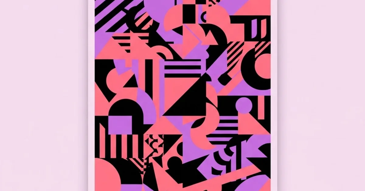
Maximalism is the most misunderstood direction in contemporary graphic design, because it is routinely confused with the absence of discipline. It is the opposite. Minimalism forgives sloppy structure, since with three elements on a page almost any arrangement reads acceptably. Maximalism punishes it immediately: put forty elements on a page without a governing system and you get noise. Maximalist graphic design is a density strategy that requires more structural rigor, not less.
Quick Answer: Maximalist graphic design uses density, layering, and abundant visual elements as deliberate strategy, governed by a strict underlying structure. It works when a clear hierarchy, a limited palette of repeating systems, and a defined focal path organize the density. Without those controls, maximalism becomes visual noise rather than visual richness.
What Maximalism Actually Is and Why It Returned
Maximalism is not simply adding more. It is the deliberate use of abundance, layering, ornament, pattern, and contrast as the primary expressive mechanism, in contrast to minimalism's reduction strategy. The distinction matters because it defines the success criteria. A minimal layout succeeds by removing everything inessential. A maximal layout succeeds by making abundance navigable.
The return of maximalist approaches in recent years has a clear structural cause: differentiation pressure. When a large share of brands adopted the same reduced sans-serif, generous whitespace, soft-neutral approach, that language stopped communicating sophistication and started communicating sameness. Density became the available differentiator. This is a recurring cycle in design history rather than a novelty, and treating it as a permanent new normal rather than a phase of a cycle is a mistake.
There is also a technical driver. Display quality, rendering capability, and production methods now support levels of detail that would have been unprintable or unreadable a generation ago. Complex layering, fine ornament, and rich color interaction are simply more achievable, which expands what designers can attempt.
It is worth separating maximalism from adjacent things it gets confused with. It is not clutter, which is unintentional accumulation. It is not eclecticism, which is mixing sources without a governing logic. And it is not decoration for its own sake, though bad maximalism frequently is. Properly executed, every element in a maximalist composition serves the hierarchy, the rhythm, or the meaning. Understanding this puts it in the same evaluative frame as any other approach, which the structural analysis of what makes design examples succeed lays out in detail.
The Structural Rules That Make Density Work
These are the controls that separate rich maximalist work from chaotic layouts. Violate them and density collapses into noise regardless of how attractive the individual elements are.
- One dominant focal point, non-negotiable. Density without a clear entry point gives the eye nowhere to land. Establish one element that is unambiguously first, usually through scale or isolation, before adding anything else.
- A strict underlying grid, even if invisible. Elements can overlap, rotate, and break the grid, but they must break a grid that exists. Random placement reads as accidental; deliberate deviation from a visible structure reads as energy.
- Limited systems, unlimited instances. Use two or three type families, three or four shape languages, and a bounded palette, then repeat them many times. Forty elements drawn from four systems reads as rich; forty elements from forty systems reads as chaos.
- A defined reading path. Plan the sequence in which the viewer encounters information, then use scale, contrast, and alignment to enforce it. Maximalism fails most often because the designer arranged elements without deciding what should be read second.
- Contrast discipline within density. Legibility depends on contrast between a foreground element and whatever sits directly behind it. In layered work this must be checked element by element, not globally.
- Rest areas inside the composition. Even the densest work needs a small number of calm zones. These are not empty margins; they are pauses that make the dense areas readable by comparison.
- A stated refusal. Choose something you will not do: no photography, no more than three colors, no rotated type, no gradients. A constraint inside abundance is what keeps it coherent.
Maximalism Versus Minimalism in Practice
Neither approach is superior; they serve different conditions. This comparison helps you choose deliberately rather than by fashion.
| Dimension | Minimalist Approach | Maximalist Approach | Selection Signal |
|---|---|---|---|
| Primary strength | Clarity and speed of comprehension | Distinctiveness and emotional intensity | Choose by whether clarity or memorability matters more |
| Failure mode | Generic and forgettable | Noisy and unreadable | Which failure would damage the project more |
| Production cost | Lower, fewer assets and colors | Higher, more assets and print complexity | Budget and print method constraints |
| Scalability by others | High, easy for non-designers to apply | Low, usually needs designer execution | Who will produce assets going forward |
| Best content fit | Functional and information-critical | Cultural, editorial, and expressive | Consequence of a reader misreading |
When Maximalism Is the Right Choice
Selecting maximalism should be a reasoned decision tied to the brief, not a stylistic preference. There are specific conditions where it outperforms.
The first is severe differentiation pressure in a homogeneous category. When every competitor uses the same reduced visual language, density is the fastest route to being noticed. This applies strongly in crowded consumer categories and in cultural sectors where standing out has direct commercial value.
The second is content that is genuinely abundant. Festival programs, magazines, catalogs, event identities, and cultural institutions have a lot to say, and forcing that content into a minimal framework produces either endless pages or omitted information. Maximalism is honest about abundance rather than hiding it.
The third is an audience that rewards exploration. Some contexts involve viewers who will spend time with the artifact: a poster on a wall, an album package, a book, a website someone visits repeatedly. Density rewards repeat viewing because it reveals new elements over time. Density fails badly where the viewer has three seconds.
The fourth is an expressive or subcultural brief where emotional intensity matters more than efficiency. Music, nightlife, art, independent publishing, and youth-oriented brands often need work that feels like something, and reduction is a poor tool for intensity.
Conversely, maximalism is the wrong choice for safety information, medical communication, financial disclosure, transactional interfaces, and any context where a misreading has consequences. It is also a poor choice when the brand assets will be produced long-term by non-designers, since density systems rarely survive unsupervised application. That constraint is a leadership and operations question as much as a design one, which is why how a design team sets and enforces standards should factor into the decision before the direction is presented to a client.
Common Mistakes in Maximalist Design
The first mistake is adding elements without adding structure. Each new element must be justified by the system it belongs to. If you cannot name which of your three or four systems an element comes from, it is clutter.
The second mistake is uniform visual weight. When everything is loud, nothing is loud. Maximalist work needs the same hierarchy discipline as any other work, arguably more, because there are more elements competing.
The third mistake is ignoring the smallest reproduction size. Dense compositions that work as a full-size poster frequently become unreadable mud as a social thumbnail or a favicon. Design a simplified variant deliberately rather than discovering the problem after launch.
The fourth mistake is confusing texture with content. Adding grain, noise, and distress over a weak composition does not create richness; it creates a weak composition with texture on it. Strip the texture and check whether the underlying structure holds.
The fifth mistake is neglecting accessibility. Dense layering frequently produces text over busy backgrounds with insufficient contrast. Every text element in a maximalist digital design needs its contrast checked against what is actually behind it, not against a nominal background color.
The sixth mistake is applying maximalism to a brand that will need thousands of assets a year. The economics break down: each asset requires skilled hand-execution rather than template application. Either build a generative rule that produces density automatically or choose a different direction.
A Working Method for Building a Maximalist Composition
Here is a sequence that produces controlled density rather than accumulation. It deliberately inverts the instinctive order of work.
Step one, define the hierarchy in text form first. Write out what must be read first, second, and third before opening a design application. Maximalist compositions fail at the hierarchy stage far more often than at the visual stage, and text is the fastest way to catch that.
Step two, build the grid and the focal point only. Place the single dominant element on a strict grid. At this point the composition should look almost minimal. If it does not work now, adding forty elements will not rescue it.
Step three, define your systems explicitly. Write down your two or three type families, your three or four shape languages, and your bounded palette. Also write your refusal, the thing you will not do. This document takes ten minutes and prevents the most common failure.
Step four, add in layers with a check after each. Add one system at a time, and after each layer, squint at the composition or view it at twenty percent size. If the focal point is no longer obviously first, you have over-added. Remove rather than compensating with more.
Step five, carve the rest areas. Deliberately clear two or three zones. This usually means deleting work you liked, which is the point. Rest areas are what make the dense regions legible.
Step six, audit contrast element by element. Check every piece of text against what is directly behind it in the final composition. In digital work, run actual contrast ratio checks rather than judging by eye, because layered color is deceptive.
Step seven, build the reduced variant. Produce a simplified version for small sizes, single-color reproduction, and fast contexts. This is a required deliverable, not an optional extra, and designing it yourself prevents someone else from butchering the work later.
Step eight, test with an unfamiliar viewer. Show the composition for five seconds and ask what they saw first and what the message was. If the answers do not match your stated hierarchy from step one, the structure is not working, regardless of how good the piece looks.
Key Takeaways
- Maximalism demands more structural discipline than minimalism, because density exposes weak hierarchy immediately while sparse layouts conceal it.
- Use a limited number of systems repeated many times rather than many unrelated elements, since repetition is what makes abundance read as intentional.
- Every maximalist composition needs one unambiguous focal point, a defined reading path, and deliberately carved rest areas.
- Maximalism suits differentiation pressure, abundant content, and exploratory audiences, and is wrong for safety, financial, and transactional contexts.
- Dense brand systems rarely survive application by non-designers, so plan for either designer execution or a generative rule that produces density automatically.
Frequently Asked Questions
What is maximalist graphic design?
Maximalist graphic design uses density, layering, pattern, and abundant visual elements as its primary expressive strategy, in contrast to minimalism's reduction. Done well, it is governed by a strict underlying grid, a small number of repeating systems, and a clearly defined hierarchy that makes the abundance navigable.
Is maximalism just a passing trend?
Design oscillates between reduction and abundance in recurring cycles, so the current prominence of dense work will likely moderate. The underlying techniques, layering, pattern systems, and controlled density, remain permanently useful tools. Treat it as a strategy available to you rather than a default direction.
How do I keep maximalist design readable?
Establish one dominant focal point, define the reading order before designing, limit yourself to a few repeating systems, carve deliberate rest areas, and check contrast for every text element against what sits directly behind it rather than against a nominal background.
When should I avoid maximalist design?
Avoid it for safety information, medical and financial communication, transactional interfaces, and any context where a misreading has real consequences. Also avoid it when non-designers will produce assets long-term, because dense systems degrade quickly under unsupervised application.
Does maximalism cost more to produce?
Usually yes. More colors increase print cost, more elements increase design and revision hours, and each asset typically requires hand-execution rather than template filling. Budget for that reality upfront, or design a generative rule that produces compliant density without per-asset design time.
Can maximalism work for a corporate brand?
It can, particularly in crowded categories where differentiation matters, but it requires either a dedicated internal design team or a generative system. The failure mode is a beautiful launch followed by two years of degraded application by marketers working without designer support.
Conclusion
The insight that matters most about maximalist graphic design is that abundance is a structural problem, not a stylistic one. The designers who execute it convincingly are not adding more freely; they are imposing a tighter system than a minimal layout would ever require, and the richness is what that system produces.
Your next step on any project where you are considering this direction is to write the hierarchy in plain text before you design anything, then build only the grid and the focal point and evaluate it in that near-empty state. If it does not work there, no amount of layering will fix it. For a wider view of which designers are pushing this direction credibly right now, look at who is currently shaping visual direction and how to identify them rather than copying what is already widespread.
Related articles
 Graphic Design
Graphic Design Jobs Eugene Oregon: Local Career Guide
A practical guide to graphic design jobs Eugene Oregon with selection criteria, portfolio signals, mistakes to avoid, and workflow steps for better design.
 Graphic Design
Graphic Design Jobs Entry Level: Build a Strong Portfolio
A practical guide to graphic design jobs entry level with selection criteria, portfolio signals, mistakes to avoid, and workflow steps for better design.
 Graphic Design
Graphic Design Jobs Cleveland: How to Stand Out Locally
A practical guide to graphic design jobs Cleveland with selection criteria, portfolio signals, mistakes to avoid, and workflow steps for better design.